Vintage
One Kings Lane: Mixing Vintage and Modern Styles
The internet is an amazing place! In my opinion, the most amazing thing about the internet is being able to share your ideas in hopes that it may inspire someone else. Whether it is inspiring them in cooking, organizing, or even DECORATING!
Well, I couldn’t believe it when the awesome online store, One Kings Lane contacted me and asked me to share my ideas on how I like to mix vintage finds with more modern ones. They are a fantastic store that have sales on one of a kind finds. They and I, both, are loving this style right now.

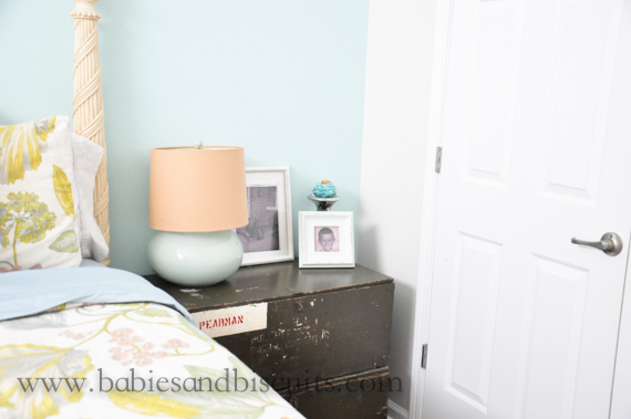
I absolutely LOVE these old army boxes that my Dad brought me a couple of weeks ago. Not only are they cool, but they tell a story. I love to imagine who it was who used these boxes and what their life was like at the time.
I decided to stack them on top of each other and use them as a bedside table, since I was needing one in my spare bedroom.

I decided to pair them with a modern style lamp and vintage pictures of my Mom and Dad. By the way, I think that is a great way to show guests they are important!

When a guest is visiting you and you have pictures of them, try placing them in the room that they are staying in. It personalizes their room and I bet they will get a kick out of it!

I happened to have this old vintage picture of my Dad as a young boy,

and this one of my Mom with her beloved cocker spaniel when she was a child. They really appreciated the gesture when they visited.

You also probably remember the lockers that Z brought home from a job that we painted and used in the entry way. They are still a “work in progress” , but they are just so cool and because of that we used them in the rest of the house as well.

We recently purchased the coolest light that has a vintage look to it to go above the lockers.

The pendant lights over the kitchen bar add to the vintage/modern design we love.

Of course, little man had to have a “superhero” red one……

and the girls’ got blue and purple ones.

I picked up this vintage sign at a flea market shop down on Ocracoke Island several years ago and it has had a spot on my wall ever since.

I bought these plates at the State flea market in Raleigh 5 years ago.

They are an unexpected piece of art placed on the wall next to modern style office accessories.

I have had this milk jug forever. I love these things. If I ever come across them, it is so hard to pass them up. I think they add such great character to any room and are great conversation pieces.
If you aren’t really sure about what category your style falls into, One Kings Lane has a great new feature they are offering to help you figure that out. It’s called their Home Decor’ Resource and you should definitely check it out!
I personally think I fall into a lot of different categories. I love so many styles! Don’t be afraid to explore and check out all the great deals they offer too!

Speaking of deals, I just fell in love with this drink dispenser! Those who know me well, know I LOVE a cool looking drink dispenser! I’ll be back in a little while! Got to go check out! 😉
XOXO,
Esther
UPDATE: Master Bathroom Shower
So, as you know, a couple of weeks ago, I gave you the week of the “Ewws, the Yucks, and the Awes!”
You got your fair share of the Ewws and Yucks.
If you don’t remember, allow me to remind you:

Remember Exibit A???
No?
What about……

Exibit B????
(Don’t worry. I’m not going to show anymore.)
We had to make the decision to redo our Master Shower after finding out that it was leaking water into our bedroom when we were installing new flooring.
Well, the shower looks a lot different now! Think I finally got my Awe!

After all that dark gunky mess, all I wanted to see was light and bright!
I am very pleased with how it turned out!

I wanted the look to be vintage, so I went with an octogonal designed tile for the floor. We used this for the flooring in the rest of the bathroom as well. The grout color was a dark grey. From what I have seen, charcoal is a common color for vintage bathroom grout, but I didn’t want it to look black, so I chose to go this route instead.

I chose a plain white subway tile for the wall with white grout. I really wanted things to look bright and I figured that using white grout would give me that look. The best part was all the tile was bought at either my local Lowe’s or Home Depot store. When I cleaned Home Depot out of their stock, I went right over to Lowe’s. They were different name brands, but the look and dimensions were the same, so you can’t tell the difference in product.

The contractor suggested going all the way to the ceiling with the tile and I’m glad he did. It really gives it a much grander look and draws your eye upwards, so it makes the shower look bigger than it really is.

Is it possible to be in love with a shower fixture? Because I think I am. Pretty sure I understand the meaning to “love at first sight” now.

It has a shower head and a seperate hand held. For me, this was so important, because I hate cleaning showers and a hand held shower head really makes this so much easier to get to all the nooks and crannies.

I really felt like the exposed plumbing pipe of the fixture added to it’s vintage charm, so I really wanted a face plate that would continue that look. The porcelain knobs that say Hot and Cold, as well as the Arrow, helped add to it.

I absolutely love this shower head. The lady at the store was really nice and was looking out for me. The original shower head that was on the faucet in the display room was different and she told me that with the thick hair I had, I would be standing there for years trying to rinse the shampoo out due to no water pressure in it. She suggested I go with this one instead and it has really made a difference. I haven’t had any problems.
HOWEVER! BE WARNED! When you go into a Kitchen and Bath store to buy a faucet, it is like going into an expensive restaurant where everything on the menu is a la carte! The pole and cord to my hand held was one price. Then the shower head was another, then the hand held was another, and then the face plate was another.
Needless to say, I paid a bit for my faucet.
It was definitely a SPLURGE, but I feel it was worth it because I know that I will be in this house for quite some time and it will probably be a nice selling feature when the times comes. I did manage to make up for it a little because my shower doors should have been $300, but were on sale for only $79. SCORE!

Those were all views from the outside looking in. But this is usually my view from the inside looking out.
Yes, Buster always guards the shower when I’m taking one.
However, below is a more accurate picture of what my view usually is from the inside looking out.

No, privacy is not something we get much in this household as of yet.


You must be logged in to post a comment.