
Home Depot
Christmas Wall Decor: Reindeer String Art Tutorial

Hope everyone is recovering nicely from their big ole’ Thanksgiving meal! We had a great time visiting with friends and family in our hometown.
I have a little confession to make. Since I knew that we would be going out of town for Thanksgiving, I wanted to make sure we wouldn’t be so overwhelmed with getting all the decorations out and putting up the tree and doing the outdoor lights and …….. well, you get the idea.
So! I decided to start decorating a week or so in advance. Before you go, “girl is crazy!”……
Don’t worry! I only started messing around with the inside. 😉
Since this was a new house and I wasn’t sure where I wanted everything, I wanted to take my time and figure it out. Also, don’t forget the most important part of me being able to change up the theme this year. Only took me 5 years to convince the hubster, but still, finally got my way this year.
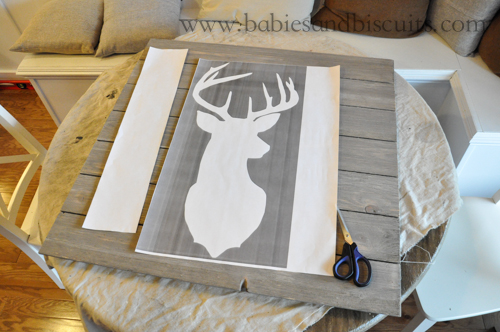
I really wanted some wall art for the house, but I couldn’t find what I really wanted and I knew that it was also going to cost me a bit because I had so much room to fill over the breakfast nook. Remember how big Penelope and Bessie are?

They are 36 x 36 and I love how they fill the space without making the wall look too cluttered with pictures.
I am going with more of a Rustic Theme this year and I have really been drawn to reindeers for some reason. I started looking everywhere, but I just couldn’t find what I really wanted.
So, I knew I was going to have to make it. LORD, HELP ME!

First things first.
I sort of had in my head what I wanted the background to look like. I wanted it to look rustic and I thought I was going to have to stain the wood to look that way, but the hubster and I happened to go by Home Depot and found these boards already made to have the appearance of EXACTLY what I was going to do to the unfinished wood I planned on using.

The boards were originally 1 x 6 x 8 ft. so we had to cut them down to the size I wanted. Since the pictures I was replacing were 36×36, I wanted the Christmas ones to be as close as possible to them. In the end, I ended up getting 3 projects out of all the boards we purchased. P.S. Look for a video tutorial to follow on the second String Art project we did to go with this one.
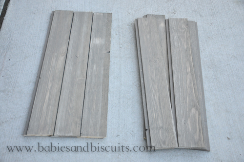
We purchased 7 of the Shiplap Boards, total. Then, we cut the pieces down to 33.75 in. each. Now lets do some math: we took each board, cut it down and got 2 boards in 33.75in. length with scrap left over of 27.5in. So, in the end, I am getting wall projects for the breakfast nook and 1 project for the outside because I just can’ t let that “scrap” go to waste.
The boards are tongue and groove so when we assembled them next to each other, they fit nicely and tight.
Might I add that the back of the wood has a pretty interesting finish to it? It almost looks like water droplets coming down, so if you were looking to be more artistic with it, that is something to think about. Using the back instead of the front.

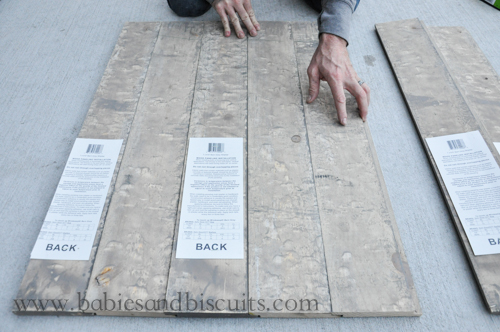
We also purchased (2) 1 x 3 x 8ft. pieces of plain white wood for the back supports seen here.

After placing all the boards side by side and into the tongue and groove area, we placed the white boards, which we cut down to 32 in. each to fit the space and laid them across the shiplap boards. Each 8ft space gave us 3 boards, with no left over scrap. This means that when I go to make my third piece, I will have to buy another 8ft. piece of wood. No worries though, because each 8ft. piece was only $ 1.48 !!!! That’s right! Cheap, y’all!

One more thing I wanted to mention before moving forward is this. Each piece of the shiplap board is tongue and groove, like I mentioned before. So, naturally, at some point, you are going to have an end piece that has an extra piece of wood sticking out. Now, you can either keep that, which would look just fine OR you can rip it down and get rid of it. We happened to have the tools to do this, but a great thing that your local home improvement store offers if cutting your boards for you!
That’s right, y’all!
They will cut them for you. I believe it is a small fee, if any and that way, you don’t have to say you can’t do a project like this because you don’t happen to have these tools at the house. With the company that we have, we just happened to have what we needed. Otherwise, I would have completely used that service at the store.
So, back to ripping the board down.

Z was feeling very helpful that day and offered to do it for me so I wouldn’t lose my thumbs, or fingers, or arm or……….
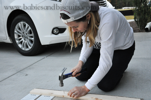
Back to attaching the boards. To make sure they were secure, we hammered a finishing nail into each board .

I just left the tags on the back of the shiplap because, well, that’s just how I roll. Yup. That’s it.

Here are the finishing nails we used for the back and also for the front for the string art. 1 box did it for this one, but I will probably have to purchase another for the second piece just to make sure I have enough. (It is a little more detailed)
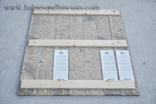
This is all three pieces of white wood attached.

Love how it turned out.

I found a reindeer silhouette that I really liked, but there was no way for me to enlarge it on my own computer to the size I needed, so I had Fedex enlarge it for me. I ended up going with a size of 18x24in. print.
I trimmed the piece and centered it the best I could.
Next,
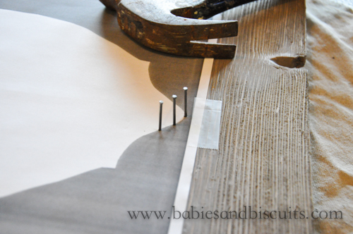
I secured it with a small piece of tape and started nailing away. You hammer the finishing nails in by tracing the outline of the silhouette.

Try to keep them spaced as evenly as possible. I started to angle the ones that were in the corners so that when I applied the string, I could create softer edges for the face.

Almost done. I have to admit that this can be a little time consuming. However, things go much faster when you have two people hammering. 🙂

Nails are all in!

And here is a closeup.

Remove tape and pull paper silhouette off. It should come off pretty easily, but may leave behind a few small papers around the nail heads. If this happens, you can simply remove with tweezers.

I had this jute twine already, but you can pick this up at your local craft store for about $5.00. *Use your 50% off coupon and get it for less!

You really can’t mess it up, but one thing I will suggest is to do something I didn’t, especially when doing the antlers because when you are looking at a bunch of nails, you can forget the pattern. When doing my second project, I will definitely outline the picture FIRST with the twine! I went back afterwards and did it so it would stick out more, but that made it more difficult during the process. I saved the original image of the silhouette and just looked at that on my laptop for guidance, but if I did it to begin with, which is probably the way you are SUPPOSED TO DO String Art, it would have been easier. LOL! Oh well!

Getting there!
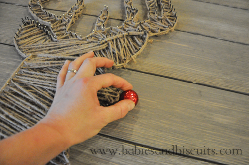
Now, you could simply let the reindeer be a reindeer, but since I was doing this for Christmas, my reindeer couldn’t just be any reindeer. No sir.
Mine had to be the one with the red nose……. The sparkly red nose in this case.

We attached these large picture hangers to the back for extra support because this big boy is quite heavy.

This was what the originally finished project looked like and

there really isn’t anything wrong with it.
BUT!
The more I looked at it, the more I felt like it started to look more like a “reindeer MUMMY” instead of a “rudolph, the red nosed reindeer”.
SO, my OCD made me go back over it and smooth out the lines a little more.

I like this version a lot more.
In fact, I like it so much, that I decided to do another one. But different. Not a reindeer. But Christmas. ANYWAY!
Really quickly, here is the price breakdown in case you want to try this for yourself:
Remember though, I made more than one project out of this! If you are only making the one, I will do my best to adjust:
- 1 x 6 x 8 shiplap boards from Home Depot: $ 11.97 per board (Need 7 Boards total to make more than one project. However, if only making one project, you would only need 4 Boards!)
- 1 x 3 x 8 white wood strips for back supports $ 1.48 ea.
- 1 1/4in. box of finishing nails (Shiny ones) $ 3.47
- Enlarged Reindeer head Silhouette $ 2.25
- Jute twine $ 5.99 (*Use 50% off coupon at AC Moore or Michaels to make $ 2.99)
- Picture Hangers $ 2.39
*All wood material was purchased from Home Depot for reference, including picture hangers.
Stay tuned! and
Season’s Greetings, y’all!
XOXO,
Esther

House Tour: Living Room and Planning Center

You know, there is just something about a comfortable, plop down on the couch, furry rug…… living room! Don’tcha think?
Well, I do!
Folks, I can’t think of a more comfy space than the living room in my house. I really wanted it to be this place that was easy to keep clean but also a place where you could do just that…… PLOP! Just come in and sit right down. Kick up your feet and stay a while. Well, not too long, I suppose! LOL!
In order to do that, I knew I was going to have to put things that were easy to wash, were soft, but could also take the abuse that my family would give it.
Yes, I jumped on the white slipped cover “band wagon” . We went to IKEA right before we moved in and bought these couches. BEST DECISION EVA!
I really love how the white is so versatile, yet can be washed if it were to get dirty. When I bought these, I chose to get a second set that was a darker gray. My idea is to switch them out every few months. Hopefully, this will help with the longevity of the slip covers. If not, the good thing is they are not expensive to replace and who doesn’t like a good excuse to go to IKEA, right? 😉

My last couch was a wrap around and we literally had it until it began to dry rot. I am not one who likes to buy a really expensive nice couch when I know my kiddos are probably going to spill something on it , or, like my little man, use it as a trampoline or a base jump spot to dive off of. *What is it going to take to make that KID stop! AHHHHHH! That one is definitely going to be my ER baby!
I yell and yell at my whole family and tell them that we will not be eating or drinking on this AT ALL, but let’s be honest. That is like saying the same thing about a new car. You have really good intentions initially, and then that one day comes where you make the exception and suddenly it goes from looking like this:

to looking like THIS:

Well, hopefully not this bad. I mean, we don’t smoke so we shouldn’t have the cigarette packs and all. 😉

When we first moved in, we only had our fireplace on the wall here. I knew that I wanted to do built ins, so I called Steve Egloff from The Wandering Woodshop who did all the carpentry work in our house and together we came up with plan. He custom designed the built ins to work for my space.
If you notice, the thermostat was put on the wall very close to where I wanted the built ins to go, so made sure the design would work with the position of the thermostat and still look good and symmetrical for the space.
I think he did a fantastic job!

We went with a backing that has an unfinished horizontal boarding. At first, my plan was to white wash the backing, but after looking at for a day, I noticed that the backing was really picking up some of the yellow and tan accents I had in that space so I decided to keep it and I am so happy that I did. It also, to me, has a beach feel and since I have coastal accents in my house, I LOVE IT!
*Reference Purposes: The color of the blue paint that is used on the accent wall is Benjamin Moore’s Labrador Blue. Benjamin Moore’s Revere Pewter is the main color on the wall.

I really love the contrast of the honey tones on the back of the space work so well with the greens and silver.

We went with some of the same hardware that we have used in the kitchen and the baths throughout the house. They are from The Martha Stewart line at Home Depot. They are usually in the store and also in stock.

We went with a lot of the same squared off craftsman style cuts we have used on other detail projects in the house.

It’s really believe it is all in the details, and Steve really takes the time to do that.

On to the thing that was probably one of the biggest reasons we chose this house. For as long as I can remember, I have tried to create a “command center” or area that we can utilize for the kids things or things for the home that require planning. Papers always overflow if they do not have a home. Homework always ends up on the dinner table. I could go on and on……….
BEHOLD!!!!!!
THE PLANNING CENTER!
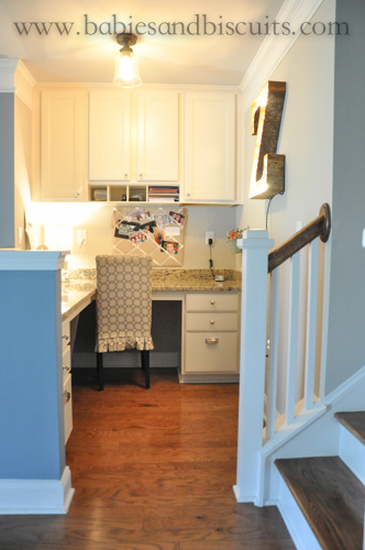
I am so happy we have this space. It is out of the way at the base of our stairs and holds all the homework items, important papers, and crafting items that one could need.

Everything is nice and hidden behind the cabinet doors and the countertop stays open for the kids to spread their homework out.

I made sure when we were adding electrical outlets, that I added plenty in this space for purposes of charging any phones, tablets, laptops etc. While we are using the cubby areas currently for scratch paper for homework or construction paper for projects and headphones, and staplers……. the first thought we had for the space was “WOW! We that space would be perfect for the tablets and ipods! The ideas are endless !

I decided to put a photo holder in the space for fun memories and and also put an IKEA organizing bar in the corner too. The extra hooks are there to hold up to two more buckets as the need grows to have them.
Even though the light above the space is casting a yellow glow, the granite is actually not that yellow. The color for reference purposes is Santa Cecilia.

Hardware for the space is a mix of Martha Stewart silver knobs and square cup pulls (Special Order) from Home Depot on the lower cabinet area and a glass knobs for the upper cabinets. I couldn’t find them online, but they are always in stock at either Home Depot or Lowes for about $3.50 each.

Probably the best thing about this area of the house is this. You can’t see the mess that might be made behind the wall that it resides behind.
-
We have had the Z Marquee Light for a little while now and got this from our good friends at Vintage Marquee Lights. They are awesome!
Well, my dear friends, that is all for today! Thank you so much for spending more time with me as I shared the living room space and planning center area with you today. I hope you were able to get some great ideas that may help you with your own decorating journeys.
If you have some great tips to share, or if you have any questions, please feel free to do so in the comments! I would love to hear from you.
Please check back next week where I share how I turned what might have been a girly office into a shared office space for the hubster and myself! 😉
XOXO,
Esther

New House: Dining Room and Foyer
Mornin, Y’all!
Hope your day is going well so far………..
Today, I wanted to share a few pics from our new Dining Room. I should probably mention that in our last house, we had a very open floor plan that had our kitchen, living room, and dining room all in one room. While the new house also has an open floor plan, the dining room is now in it’s own separate space.
In case you haven’t seen it, here is a quick pic of our last dining room:

While I really loved all the space that we had, it was really difficult for me to decorate that space because it always had to compliment both the living room and kitchen and very easily became cluttered all the time.
In our new house, I decided that even though the dining room now had it’s own space, I really like the simplicity of having a simple looking dining room without a lot of clutter. (*I’m thinking the last house did that to me. LOL!)
Here is our new dining room:

I was so excited when I got to take our chandelier with us and heard that the new homeowners didn’t want it. SCORE for me! I was able to pick up the curtains for the space at Homegoods. The best thing about picking up your curtains from somewhere like this is they usually sell the curtain panels in packs of two. Most stores try to sell you their curtains and charge per panel, so getting two is definitely a deal. Basically, I picked up two for the price of one. 😉

I searched high and low for this chandelier when I first purchased it and thought all the work I did looking for it and finding a deal was going to go down the drain, but nope! I’m really happy with how it looks in it’s new space. (*Side note: Color on walls is Light French Gray by Sherwin Williams)

I have had the star for quite some time now. It has mostly been outside on exterior walls, but I thought it might go well on the wall. I bought it from the flea market where I used to live for about $50. While I was in Homegoods looking for the curtains, I saw this awesome picture that went fantastic with the star.

I just love this picture so much. I also love how it is the first thing you see when you enter into our home.

You know I love painting ceilings! I mean, it is the “5th wall” afterall. 😉
We decided to paint only the highest tray ceiling area a different color. It’s only a personal preference, but for me, when you paint the both areas of double molded tray ceilings, I feel like it begins to look “choppy”. So basically, you would have color, white crown trim, color, white crown trim. I felt like painting only the highest ceiling and keeping the rest white, drew your eye up better and made the ceilings feel higher. (*Does my rambling make sense? ) The color we decided to go with is Iced Cube Silver by Benjamin Moore.

Please excuse all the lighting in the following pictures, but I didn’t take these until today and I’m not sure if you have heard, but apparently Joaquin Pheonix is reaking havoc on our coast line…….. I mean, Hurricane Joaquin. My bad, I had Joaquin Pheonix on the brain again.
ANYHOO!
This is why the lighting is not as great and my decor has changed a bit, thanks to my youngest chica. (*She loves Halloween, but really, what kid doesn’t?)
This is a better full pic of the dining room.
Just in case, for reference sake on where I got all the items are:
• Chandelier: Pottery Barn – sorry! not sure they still carry it. 🙁
• Metal Star: Flea Market – $50
• Roman Shades: Home Depot – Color: Driftwood
• Curtains: Homegoods – Tommy Hilfiger Brand – $ 26.99 for set of 2
• Table: Pottery Barn – Sumter Style – (Is a two leaf table that seats up to 10 total)
• White Chairs : IKEA – $ 50 each : IN STOCK
• Bench: Homegoods
• Rug: Grandin Road – $ 115 (Bought on sale)

While I’m at it, I thought I would share a bit about our front door. Originally, I was told that we could have our front door stained, which sent me over the moon excited. I have always wanted a stained front door. I love stained front doors. They always look so inviting and warm.
Well, it didn’t end up turning out that way unfortunately. (SAD FACE)
The sales team for our house was mistaken because the door actually came primed.
SO!
It was on to plan B!
I looked and looked at different doors on Pinterest and finally came up with the color I loved. I had to make sure that it would go well with our gray exterior color and black shutters.
The WINNER!!!!!!?????????
“Hale Navy” by Benjamin Moore.
In the light, it looks like the color above.
In the dark or less lighting, it looks more like this:

Which I’m very happy with, because I really did want the color to take on a darker hue on the inside.

And last but surely not least, this is the full view of the front foyer/hall/entry way.
I must have tried a million different pieces of furniture in that space the bench is occupying. Everything just seemed to eat up a lot of the floor space and make that area seem cramped. All but the bench that I ended up sticking with in the space. This bench actually used to be the bench that was used in the dining area at our last house. (*You may notice it in the first picture above)
I felt that it had a better place in the foyer though. The black top really seems to mimic the look of the front door (even though the front door isn’t really black).
The walls in the hall are somewhat empty right now. I know what I would like to do there, I just don’t have the budget to do it right now.
I’m hoping to wait patiently and snag a good deal on a few large canvas prints so I can fill that space with really big pics of my kiddos! Until then, it will just have to stay empty.
Items in the foyer:
• Front Door Color: Hale Navy by Benjamin Moore
• Wall Color: Revere Pewter by Benjamin Moore
• Bench: Grandin Road from 2 seasons ago.
• Flushmount Lights: Purchased at Home Depot – Hampton Bay Brand (*Cheaper than Lowes Brand)
• Throw Pillows: Color: Linen – TJ MAX – $ 10 each
Ok, my loves! Thank you so much for stopping by and spending time with me again!
I hope you enjoyed taking a look at the dining room and foyer. Next week, the incredible Steve Egloff makes an appearance again! *Or, at least his awesome work does. 😉
Next week, I plan on continuing with my tour of the downstairs and sharing our living room pics and ideas!
It includes built in cabinets and something called a “planning center”!
What is that, you ask?
Guess you will just have to check back to find out!
Until next week!
XOXO!
Esther

Kitchen Cabinets (Makeover)
It was funny.
A couple of weeks ago,
a couple of women came to my home for the first time.
I remember we were talking about where I had gotten things I decorated the room with and what had been done to the house since we had bought it and moved in.
Then, we came to the cabinets in the kitchen.
One of the women had commented on how much she liked the original deep color of the cabinets.
I started to discuss how we had just bought the paint to start my next project, which would be painting the cabinets.
It’s funny because everyone looks at you when you say the dreaded words……
PAINT THE CABINETS!…. duh duh duhhhhhhhhh!
I, myself, was even guilty of this as recently as a few years back.
In fact, my husband, THE PAINTER was even guilty of this as recently as….. oh, I dont know…. a few MONTHS ago.
We had painted ….. attempted to paint our previous home’s cabinets several years ago.
It didn’t turn out so well. (Shhhh! Don’t tell my painter I said that.)
Back then, even though Z was a painter, he wasn’t up to speed with new products and he liked to “wing it” a lot. (too much)
Now that I have bashed my hubby for a few minutes (Sorry sweetie!)…
let me take a second to praise him.
He has since become awesome! The most awesomest, cutest painter I know.
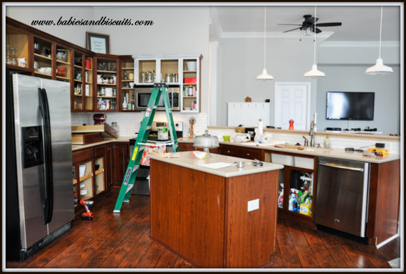
This is what our cabinets looked like before. Since we had installed the flooring in the house, everything was starting to look like one continuous color in the kitchen.
That sometimes works, but considering everything was that same brown, it was taking away from the floors moment to shine.
I really felt like if we just painted them, it would take care of it.

BUT! Then, I would have moments like this. Where I would look at it from a little distance and would think,”Now that doesn’t look so bad.”
Then I would have my “Clueless moment”. Not the mental one. The movie one.
You know, the part in the movie where Cher says, “It’s like a Monet!”
“It looks fine from a distance, but up close…………..

It’s a BIG OLE STINKIN MESS!”
I may or may not have added a few words there…..
So!
Since I only get things painted around my house when it rains…..
I got started.
It only took me 2 Rain Dances before the Rain Gods answered my request with some Wet Weather.
So, WE got started.

First we removed the doors and hardware. Then we took an electric sander and roughed them up.
Here is one like the one we used.
This is a very important step because you want to give the coating something to stick to.
If you just try to paint right over the cabinets, it will still work, but for the longevity of it, you should rough them up prior to application. Otherwise, it may start to peel a little down the road.
You can use sandpaper grit between 150 – 220 for this. For the power sander, they come in discs for this.

Then start painting! I’m going to tell you a secret…..
The paint we used for the cabinets doesn’t even need a primer prior to application!
SAY WHAT!?!
Yup! No primer! In fact, it is specially designed for cabinets and it is called Cabinet Coating.
It is a product carried by our local paint store, Spectrum Paints.
Others may carry it, but I haven’t checked. It is kind of pricey per gallon at $55/ea.
However, when you consider the fact that we only had to get 1 gallon for the base cabinets and 1 gallon for the upper cabinets AND still have left over, it is a pretty good deal.
We used a 4 in. wide Mohair Roller brush and a regular Paint brush for application.

Another great thing about this product is that it is “self leveling”, which means that when it dries, it levels out any brush strokes and looks like you sprayed it on or better yet… like you bought them that way.
We chose Benjamin Moore colors for the cabinets.
I also decided to do a “two toned” color palette.
It simply means that you go with one color for the base cabinets and a different one for the uppers.
The color for the base cabinets is Fieldstone.
The color for the upper cabinets is Vanilla Milkshake.

AND VOILA!
Now, I know what you are saying….. Ummmm. That’s a lot of gray!
Well, my camera was having a hissy fit that day and for some reason, everything looked very much the same color.
(It’s not though.)

Here is a little better idea of what it looks like. I know it is hard to believe, but the base color is actually darker than it appears in the picture.
I just love the way they turned out.

The floors finally have their moment to shine and do not have to compete with the cabinets any longer.

It’s like a breath of fresh air now coming into the kitchen. It’s so light and airy and somewhat beachy without being “cheesy beachy”???

The wineglasses finally have a home of their own.

The crystal knobs make me smile. FYI: Lowes and Home Depot have them for $3.97 ea.

Z hung my pot rack that I stole off of Joss and Main for $102.00, which might sound like a lot, but when you consider the fact that it has even a small amount of copper in it, it is an awesome price!
So, now I have more room in my cabinets.

I know I have shown shots of my little “conversation area” a million times, but I have added a light over the end table, so I had to share.
Probably won’t be the last time I throw a pic of this spot up here either.

See! Told ya! (Here is a closer look at the light)

I have been wanting this phrase for a while and saw it at a friend’s vinyl letter party, so I bought it right away. If you like it, email me and I can give you the name of the rep that I bought it from.
(Now, if I can only get Z to paint the crown…….)

I used to be that person who hung plates ALLLLL around her house. I have since toned it down a little, but when my mom bought this set for me for Christmas, I knew exactly where it was going to go.
The words are from “Patty Cake, Baker’s Man”, which my mom used to sing with me all the time when I was a baby, and I have with my own babies.
(Made me cry when I opened it.)

I let the light be darker in this picture, so it could really pick up on the green in the base cabinets.

I have wanted a set of measuring spoons like this ever since I saw Paula Deen’s on her show. Her’s were real pewter and I wasn’t about to spend that kind of money on something that I was going to get dirty all the time. LOL!
So, while Christmas shopping, my mom and I stumbled upon these at a cute shop in Myrtle Beach for $24.95. They have the same look of pewter without the price tag!!!!
I have since seen them all over, so if you do not plan on traveling to Myrtle Beach anytime soon, you could still find them.
*I just wanted to drop a little note. While I like to think I know a lot about painting, the truth is ……. I don’t. (I only know a little)
The other truth is…. Z DOES!
It’s his job and passion and has been for years.
I usually type my posts while he isn’t here. Then, he usually comes home and says, “Why did you tell everyone to buy that type of paint?!!?” Ooops!
Then, I go back on my site and correct what I wrote wrong! YIKES! LOL!
SO!
If you should have any questions at all, please feel free to email me and let me know and I will ask the EXPERT!
Then! I’ll even write you back with the answer! 😉
*I also wanted to add that the reps at Spectrum Paint said that while they can pretty much do any color in the Cabinet Coating, the best results are with “Pastel” colors. Apparently, the darker the color, the softer it makes the Coating.
The lighter colors do not break down the Coating and allow it to harden as it dries, yielding better results!
Hope you found some inspiration with the kitchen cabinets. I will probably do an update soon. We plan on painting the ceiling…..
Happy Thursday!
-Esther

 |
 |
|
 |

You must be logged in to post a comment.