
Benjamin Moore
House Tour: Kitchen and Butler’s Pantry

Do you remember on the MTV Cribs show where they would come to the Master Bedroom part of the tour…… and they always say, “And this is where all the magic happens!” insert: Gross puke face .
I always get grossed out at that part and if one of the people they are showing chooses not to say that part, I instantly like them much more.
Well, for me, I would have to say that about my Kitchen. Sorry, husband.
It’s true! I think my kitchen is by far the favorite spot in the house for me. Lets be honest ladies, we practically live there and have thought at one point or another about how hard it might be to incorporate some kind of sleeping area into the design.
Even though, with our house, we had to choose the same cabinets throughout the house, I was determined to inject character and texture into the space.

I really love to cook and I have collected a fair amount of cookbooks over the years. This picture doesn’t actually truly reflect the amount of cookbooks I have. I am slowly going through our storage unit and haven’t brought them all into the house yet, but I really wanted a space that was solely for them.
I initially got the idea to add something like this when I became a fan of Last Man Standing starring Tim Allen. In the show, they have something like this on the end of their kitchen island that looks like it was built with the island to begin with.

I didn’t have the luxury of extending the island counter top over the cookbook unit, but I really like how it turned out in the end.
I called who else but my local go to craftsman, Steve Egloff from The Wandering Woodshop and together, we came up with the idea of using reclaimed wood. I told him what I wanted it used for and he designed the perfect piece. He actually surprised me with the finish by taking the same color we used on our accent wall in the living room (Benjamin Moore’s Labrador Blue) and watered it down to create the wash he used over the wood.
The end result was perfect!

Some areas of the unit come through bluer than others and it’s awesome!

As you can see, the height is just a step down from the top of the counter top. Look at how pretty the knots of the wood come through! I heart reclaimed wood! Can you tell? 😉

Moving on to the barstools. Or should I say, counter stools? The reason I say this is because when looking for chairs, it’s important to know this. I literally almost made the mistake of ordering barstool height as opposed to the counter height stools. I was so used to just getting bar height in the past, that I never stopped to think about it.
Since we decided to go with the island top being all one level and not staggered, it made the height of the counters, well counter height. So, keep this in mind when shopping for stools. I purchased these from Target. I have been very happy so far. The only gripe is with 3 messy eating kids, I have to use the attachment of the vacuum that allows me to get small crumbs out of the nooks and crannies of the rattan instead of just wiping it off.
Love the texture it lends to the area.

I’ve posted about some of the hardware I chose to go with before in other parts of the house, but I decided to go with this again in the kitchen. I mixed and matched knobs so that nothing was too matchy matchy. I have been asked in the past how to make a space looked lived in and cozy from the start. I feel like this is one of the best secrets to doing this. Nothing should match to much. You should try to mix and match finishes, colors, textures that compliment each other. With the hardware I chose, the finishes match. However, the styles do not. It creates the same effect.

I went with a glass knob for the upper cabinets and a chrome look for lower cabinets, mixing circular knobs and squared off knobs.

I also used different sizes of the same bar style hardware pulls that I purchased from The Home Depot.

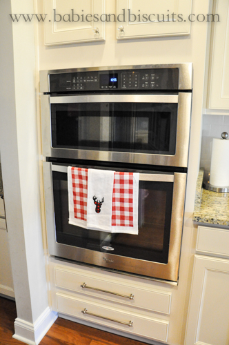
I didn’t realize that the fridge area would have a cabinet surround at first and I am happy that I decided to wait before purchasing the fridge for the space. It would have looked funny if we hadn’t purchased a counter depth fridge instead of a standard one. The standard one would have stuck out way too far and looked too large for the space. The counter depth was perfect!
We purchased ours from Home Depot and at first, I wanted a Frigidaire that had the bar bell handles like the hardware I chose for the cabinets and that stinkin fridge was almost $3000!!!!!!! Girlfriend, say WHAT????
I just figured I couldn’t get it until I was surfing the internet and found a Maytag version for significantly less, which sidebar: Aren’t they a Frigidaire company? Y’all ain’t fullin anyone! (See mom? Private school really DID pay off!)
Well, I ended up paying 1/2 that price for the one we got and it looks just like the one I originally saw! Yeahhh doggie! SCORE!

I probably should mention another thing. I meant to write a blog post about the kitchen WAY before it got close to decorating for Christmas. Oops!
This hopefully explains why you see a lot of red and perhaps a christmas tree or wreath. LOL! There will be much more to follow that in the coming days. I finally got my way this year and I get to change up the decor a little. For the longest time, we have had a Grinch Who Stole Christmas type of theme. I finally get to do my Rustic Cabin Christmas theme this year! Look for a tutorial on wall decor, coming soon.
Speaking of Rustic Christmas decor’. Have you seen Target’s dollar spot this year? They have a fantastic selection of christmas stuff this year. Especially if you are swaying towards the same type of theme that I am.

I picked these kitchen towels up there the other day for only $3. I love the plaid!

Another thing we did in the kitchen to give it some character was paint the vent hood. All the cabinets were the same color originally. A sort of off white/cream white. I asked Steve to add the two wood trim pieces that are coming down the center. He did that by simply gluing them in place. Then, we went back in and painted the hood the same color as the island. (*Benjamin Moore’s Fieldstone Gray)

I used the same color in my previous home on the bottom cabinets. Here is the blog post I wrote about painting the kitchen cabinets in that home.

Another way to add character and insert your own style is by changing out your light fixtures. We decided to go with the cheapest lighting package the builder offered because we knew we were going to change them out anyway over time. I bought these from Lowes and are from their Allen and Roth line. I had saw a pair of light fixtures that Joanna Gaines used in a home she did on Fixer Upper and I absolutely loved them……. until the cheapest pair I could find were over $200 each. Since we were having to do a lot of different projects to the house and I knew that buying two that price would eat up my budget, I decided to go with these instead. To be honest, they reminded me a lot of the ones I loved and I wasn’t the least bit sad that I chose to go with them.
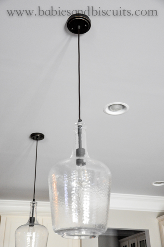
They have a blown glass look and go perfect with the craftsman detail in the house.
I also wanted to share something with you that makes me smile every single day! I love this part of the house. You guessed it, the Butler’s pantry. I have always wanted one of these. I mean, like, ALWAYS!!!!!!!
Over the years, I have kept a running list of things I would want in my dream home and this was at the top of the list.

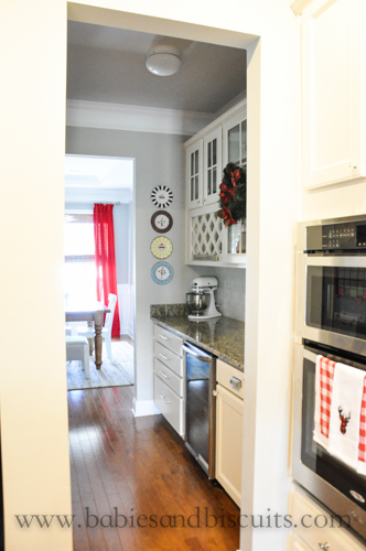
It is a small room off the kitchen that connects to the dining room. It’s the perfect spot to store things that you use frequently, but do not want to necessarily have out all the time. I keep our things like our coffee pot in here and my mixer.

There is a built in area for wine bottles. We store canned items above that and we keep things like wine glasses and coffee mugs in the center area.

I carried the look of the same hardware into this area too. I love these, if you can’t tell. 🙂

On the other wall of the Butler’s Pantry is the regular pantry (which I am going to go more into detail at a later date. You will see why. 🙂 )
Another thing on this wall is our magnet board.

Steve made this for me as well as a few more for the kids rooms.

I keep important reminders as well as school craft papers the kiddos bring home. I also keep a weekly calendar there as well and pretty much anything that might have ended up on the fridge, ends up here instead.

Back in the kitchen, another detail we added was the same type of wood work we used throughout the wall detail in the house. It is the simple squared off look that we used before. Afterwards, we went back and painted it the same color as the hood. (*Benjamin Moore’s Fieldstone Gray). I think it makes the island look more like a piece of furniture.

One more thing I wanted to mention is the counter tops. Since we went with a nation wide builder, we only had a few choices when it came to the granite. We decided to go with this color. The color is called Santa Cecelia. I must have Pinterest searched this color a million different ways so that I could see it with every possible color combo for the cabinets (etc.).

I am really happy with our choice.

Well folks, that’s all for today. I hope you enjoyed walking through my kitchen with me. I am so happy that you chose to spend a little time with me today. If you have any questions regarding any of the items you have seen in this post, please comment below and I will make sure to answer them.
Please make sure to check back regularly for more posts on our new home. It’s Christmas time, so I will be sharing decorating ideas and diy projects very soon!
XOXO,
Esther

House Tour: His and Hers Shared Office

Have I ever told you about my lovely obsession with all things Ikea? I would seriously buy the entire store if it weren’t for my partner of reason, aka…… The Hubster.
I have had to pull him back a few times on things, but mostly, it is him doing the tugging.
It was no different for our office. In our past home, I was the only one “operating” out of the office area, so I made it 100% girly! I take care of the office portion of our company so it was pretty much my say in how we decorated the space before.
I’m talking hot pink chair meets aqua blue walls ……. you get the picture. 😉
Since then, things have morphed into the hubster spending more time in the office with me, so I knew that in the new space, it was going to have to be gender friendly, which I knew was going to totally cramp my style. I mean, how dare he make me feel like I have to get rid of my pink chair??? LOL!

First, I’d like to start with the desk. When the hubster and I work together, we usually are having to brainstorm with each other on projects and such so I knew that facing away from each other was not going to work for us. We needed a desk that we could both use and would allow us to gaze into one another’s eyes and think deeply about ………………. painting estimates. 😉

I purchased two of these beauties from Ikea from their Alex line.

We placed them back to back with each other and hired our awesome contractor, Steve Egloff to make us a table top. I really liked the feel of a modern look for the space so I asked him to do an industrial feel for the legs. After looking for the material and figuring out that the legs were going to cost more than we wanted to spend, Steve had a great idea to use closet rods for the area.

Absolutely GENIUS!!!! It allowed us to still have the look we wanted without the cost.
Not only cool, but anything that saves me money is a SUPER PLUS! ………….. HOLLA!

For the top, we went with a nice soft gray stain at Sherwin Williams. Now, I love being able to just say what the name of a color is, but for this stain, it wasn’t that easy. They have an area that has basic stains and since I didn’t want to wait for stain that I chose due to us having to order it, I chose, instead, to go with a clear stain that they added gray to until we got it the shade I wanted.
I wish I could have had an exact color to reference, but to be honest, it is kind of fun experimenting with the colors and knowing that you came up with the shade on your own, so if you are looking to choose a gray stain color, go to your local paint store and ask them to do the clear stain and then find a shade of gray you like in a paint color and ask them to make it as close to that color as possible and HAVE FUN!

Here is a close up of the color and natural wood peeking through from underneath.

If you haven’t figured out by now, I am really into the look and feel of invoking a coastal meets rustic meets industrial meets farm style in my house………… not complicated at all, right? Otherwise known as, tastefully eclectic. Or at least, I hope tastefully.
We knew we wanted to do a focal point in the room with an accent wall. I am a HUGE Fixer Upper fan. (*WHO ISN’T????)
I love the look of Shiplap and I wanted to bring that look into my own home, so I called on Steve, once again to install tongue and groove on the wall next to our desk.
He started out with an unfinished wood because we weren’t sure if we were going to stain it or white wash it.
Well,
it looks like white washing won out in the end.
P.S. PLEASE do NOT tell Steve. He would have a HEART ATTACK if he knew we white washed his beautiful unfinished wood. (*Conversation I had with Steve during the install: Steve: So what do you think you will do to the accent wall? Are you going to leave it as is? I think it looks great the way it is now. Me: Not sure yet? Maybe stain it, maybe white wash it? Steve: Oh NO! You never white wash perfectly beautiful unfinished oak planks.)
Ummmmmmmm, yeah………… So, please don’t tell him. It can be our secret.

We wanted to make it look weathered and not too perfectly white washed, so we tried to make it not as uniformed.
I absolutely love love love it. Sometimes our company can stress both of us out and this space is just so relaxing.

In order to get the color of the white wash, we took a small amount of paint and thinned it out significantly with water until we got it to the color we wanted.

Then finished it off with a sweet picture I picked up from Homegoods. I like to say it is more on my side so technically, I am more “like a boss” than him, but who is counting…………….. 😉

On the opposite wall, we placed the filing cabinet/shelving unit I had been eyeing for months and months. It finally went on sale at Pottery Barn and I pounced. I ended up saving almost $500!!!! From what I have seen, they usually keep it in stock. It is part of their modular Bedford line.
I am not disappointed at all. It is very sturdy and seems to be very well made. I have not regretted any purchase I have made from Pottery Barn so far. The only thing is, I have to really plan and save for the items I purchase due to their prices, but it is worth it.

In the corner, I placed a wall file holder I had in our last home that I also picked up from Ikea. Paint color on wall is the main color in our house: Benjamin Moore’s Revere Pewter, which is a “graige”. Gray/Beige.

I love that it stays on the wall and does not take up any counter space.

On the wall by the door, is our planning center for the upcoming projects that we are doing and our current projects we are working on.

These magnetic boards are also from Ikea and have white magnets that you can purchase separately there for it. I chose to use my label maker and do categories for the planning board that helps me stay on top of everything. (*I removed a lot to protect information on the projects, but you get the idea.)

I literally planned this entire room around this light fixture. Like I mentioned before, I knew I wanted that industrial feel in here and this was the only light fixture I could picture in here. Since the desk is more to the side and the light fixture is centered in the room, we swagged it over with a ceiling hook to have it centered over the desk. The best thing about the light fixture is the price. For a light fixture like this, you would probably pay a lot! Not at Ikea! Here is a link to the fixture from their Hektar line. We paid only $69 for this huge monster!

I really wanted to be able to walk in to the room and feel that it had a female presence as well as a male so I decided to go with these two chairs they sell at Costco. I purchased one white for me and……

one black for him. I am so glad that I did. He has a tendency to show up splattered in paint or some foreign matter from time to time, so the black helps to hide that. 😉 *LOVE YOU, BABE!

And last but certainly not least, here is my disorganized closet. Can I just tell how much I love having a closet in my office? I know it seems so simple. A little closet in a room. However, I did not have this in my last office and it REALLY makes a difference. I can hide stuff in there like a printer! Mine always became an eyesore and even though I needed it, I didn’t like the junky look it had. Now, I can just close the door and forget about it. It is wireless, so it isn’t necessary to attach to my computer and I just sneak the extension power cord under the door and plug it in right next to my desk. Problem solved!

Well, my lovely friends, thank you thank you thank you for spending more time with me and taking another peak into this crazy thing I call a home.
I hope you have enjoyed another installment of the new house tour.
That fall time air is really calling my name and I hope to share a new recipe with you next time as well as a post about the true heart of our home……… THE KITCHEN!
Until next time,
XOXO,
ESTHER

New House: Dining Room and Foyer
Mornin, Y’all!
Hope your day is going well so far………..
Today, I wanted to share a few pics from our new Dining Room. I should probably mention that in our last house, we had a very open floor plan that had our kitchen, living room, and dining room all in one room. While the new house also has an open floor plan, the dining room is now in it’s own separate space.
In case you haven’t seen it, here is a quick pic of our last dining room:

While I really loved all the space that we had, it was really difficult for me to decorate that space because it always had to compliment both the living room and kitchen and very easily became cluttered all the time.
In our new house, I decided that even though the dining room now had it’s own space, I really like the simplicity of having a simple looking dining room without a lot of clutter. (*I’m thinking the last house did that to me. LOL!)
Here is our new dining room:

I was so excited when I got to take our chandelier with us and heard that the new homeowners didn’t want it. SCORE for me! I was able to pick up the curtains for the space at Homegoods. The best thing about picking up your curtains from somewhere like this is they usually sell the curtain panels in packs of two. Most stores try to sell you their curtains and charge per panel, so getting two is definitely a deal. Basically, I picked up two for the price of one. 😉

I searched high and low for this chandelier when I first purchased it and thought all the work I did looking for it and finding a deal was going to go down the drain, but nope! I’m really happy with how it looks in it’s new space. (*Side note: Color on walls is Light French Gray by Sherwin Williams)

I have had the star for quite some time now. It has mostly been outside on exterior walls, but I thought it might go well on the wall. I bought it from the flea market where I used to live for about $50. While I was in Homegoods looking for the curtains, I saw this awesome picture that went fantastic with the star.

I just love this picture so much. I also love how it is the first thing you see when you enter into our home.

You know I love painting ceilings! I mean, it is the “5th wall” afterall. 😉
We decided to paint only the highest tray ceiling area a different color. It’s only a personal preference, but for me, when you paint the both areas of double molded tray ceilings, I feel like it begins to look “choppy”. So basically, you would have color, white crown trim, color, white crown trim. I felt like painting only the highest ceiling and keeping the rest white, drew your eye up better and made the ceilings feel higher. (*Does my rambling make sense? ) The color we decided to go with is Iced Cube Silver by Benjamin Moore.

Please excuse all the lighting in the following pictures, but I didn’t take these until today and I’m not sure if you have heard, but apparently Joaquin Pheonix is reaking havoc on our coast line…….. I mean, Hurricane Joaquin. My bad, I had Joaquin Pheonix on the brain again.
ANYHOO!
This is why the lighting is not as great and my decor has changed a bit, thanks to my youngest chica. (*She loves Halloween, but really, what kid doesn’t?)
This is a better full pic of the dining room.
Just in case, for reference sake on where I got all the items are:
• Chandelier: Pottery Barn – sorry! not sure they still carry it. 🙁
• Metal Star: Flea Market – $50
• Roman Shades: Home Depot – Color: Driftwood
• Curtains: Homegoods – Tommy Hilfiger Brand – $ 26.99 for set of 2
• Table: Pottery Barn – Sumter Style – (Is a two leaf table that seats up to 10 total)
• White Chairs : IKEA – $ 50 each : IN STOCK
• Bench: Homegoods
• Rug: Grandin Road – $ 115 (Bought on sale)

While I’m at it, I thought I would share a bit about our front door. Originally, I was told that we could have our front door stained, which sent me over the moon excited. I have always wanted a stained front door. I love stained front doors. They always look so inviting and warm.
Well, it didn’t end up turning out that way unfortunately. (SAD FACE)
The sales team for our house was mistaken because the door actually came primed.
SO!
It was on to plan B!
I looked and looked at different doors on Pinterest and finally came up with the color I loved. I had to make sure that it would go well with our gray exterior color and black shutters.
The WINNER!!!!!!?????????
“Hale Navy” by Benjamin Moore.
In the light, it looks like the color above.
In the dark or less lighting, it looks more like this:

Which I’m very happy with, because I really did want the color to take on a darker hue on the inside.

And last but surely not least, this is the full view of the front foyer/hall/entry way.
I must have tried a million different pieces of furniture in that space the bench is occupying. Everything just seemed to eat up a lot of the floor space and make that area seem cramped. All but the bench that I ended up sticking with in the space. This bench actually used to be the bench that was used in the dining area at our last house. (*You may notice it in the first picture above)
I felt that it had a better place in the foyer though. The black top really seems to mimic the look of the front door (even though the front door isn’t really black).
The walls in the hall are somewhat empty right now. I know what I would like to do there, I just don’t have the budget to do it right now.
I’m hoping to wait patiently and snag a good deal on a few large canvas prints so I can fill that space with really big pics of my kiddos! Until then, it will just have to stay empty.
Items in the foyer:
• Front Door Color: Hale Navy by Benjamin Moore
• Wall Color: Revere Pewter by Benjamin Moore
• Bench: Grandin Road from 2 seasons ago.
• Flushmount Lights: Purchased at Home Depot – Hampton Bay Brand (*Cheaper than Lowes Brand)
• Throw Pillows: Color: Linen – TJ MAX – $ 10 each
Ok, my loves! Thank you so much for stopping by and spending time with me again!
I hope you enjoyed taking a look at the dining room and foyer. Next week, the incredible Steve Egloff makes an appearance again! *Or, at least his awesome work does. 😉
Next week, I plan on continuing with my tour of the downstairs and sharing our living room pics and ideas!
It includes built in cabinets and something called a “planning center”!
What is that, you ask?
Guess you will just have to check back to find out!
Until next week!
XOXO!
Esther

Laundry Room Make Over Series: DIY “WASH” Sign

I have been wanting to “Spruce” up my Laundry Room for a while.
I didn’t want to break the bank in the process though, so I decided I would do it in fazes. This is the first post in a series of posts I will do as I update it. 🙂
I had seen the letters “W A S H” on someone else’s Laundry Room wall and I decided to do it myself. I think it was Kathryn from Do It On a Dime, which is a Youtube channel, but she also has a blog that she started recently to go along with it. LOVE her! She has great tips for ……. you guessed it, Doing things on a Dime, or on the cheap. You can check out her youtube channel here, and her blog here.
So, first off, I went to my local craft store, AC Moore and bought the unfinished wooden letters. They were 2 for $5.00, which I thought was pretty good.

I also picked up a can of Rust-Oleum’s Painter’s Touch Spray Paint in a Metallic Aluminum Color for $6.99. My walls are painted Stonington Gray by Benjamin Moore in the Laundry Room and instead of painting them a contrasting color, I wanted them to have almost an “embossed” look, so I chose a color as similar as possible to the wall color.

I sprayed them with 2 light coats of paint and it covered VERY VERY well.

This was the end result, which I’m really happy with.
However, I might move the letters because since I did the letters, we have decided to do a few more updates to the Laundry Room, which I am REALLY excited about.
I will make sure to do updates on it as we progress through the work.
While I was at it, I decided to take a White Wired Trash Can I purchased at the Dollar Tree and spray it too.

While you might not be able to tell a huge difference on photo, it did spice it up a little and not make it look so “Dollar Tree”ish. Did that sound bad? I hope not. I was definitely happy with the fact that I was able to get more uses out of the one can of spray paint and still had some left to do other projects!
Stay tuned for more updates on the Laundry Room Makeover!
XOXO,
Esther

 |
 |
|
 |

You must be logged in to post a comment.